In today’s fast-paced digital landscape, with countless marketing channels and complex customer journeys, figuring out the best way to use your marketing budget can sometimes feel like shooting in the dark.
Ready to explore the world of Marketing Mix Modeling (MMM)? In this article, we demystify this powerful analytical approach. Whether you’re an experienced marketer or new to the field, our comprehensive guide equips you with the knowledge and tools to leverage marketing mix modeling effectively.
Let’s deep dive!
Long story short
- Marketing Mix Modeling (MMM) optimizes your online performance by using historical data to gauge how different marketing activities affect sales. Its importance has grown with reduced tracking capabilities, providing key insights for future strategy planning and enabling better budget allocation across marketing channels.
- MMM involves different types of models that uncover connections between marketing efforts and business outcomes. The method calculates the impact and return on investment (ROI) of each marketing channel and generates response curves to help optimize budget allocation.
- Open-source tools like Meta’s Robyn and Google’s LightweightMMM provide practical solutions for running a Marketing Mix Model. Robyn uses a Ridge Regression approach, while LightweightMMM uses a Bayesian approach.
- Challenges to implementing MMM include selection bias, data limitations, and model selection. It’s crucial to have adequate and quality data for effective implementation.
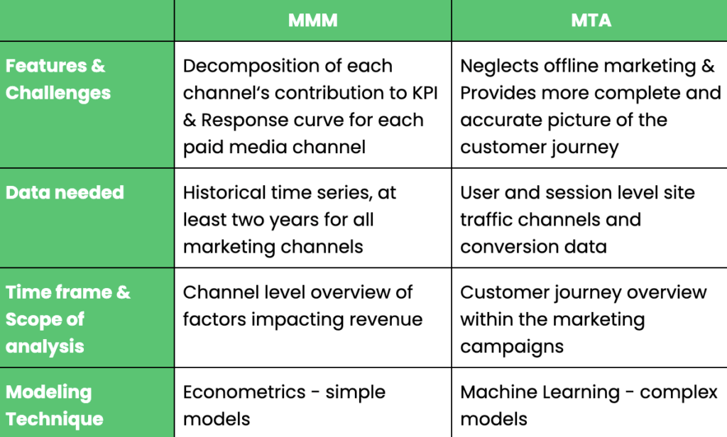
- MMM differs from Multi-Touch Attribution (MTA), which credits every touchpoint along the customer journey. MMM provides a broader perspective, while MTA focuses more on the individual touchpoints.
- Nexoya optimizes the marketing mix by integrating a data-driven approach, which allows for the strategic budget optimization across various marketing channels.
Table of contents:
- What is Marketing Mix Modelling (MMM)?
- Deep dive into MMM models
- Challenges to consider before implementing MMM
- Marketing Mix Modeling vs Multi-Touch Attribution
- NEXOYA vs MMM: Sounds complicated, what about Nexoya?
What is Marketing Mix Modelling (MMM)?
Marketing mix modeling is a data-driven method that uses historical data to measure the sales impact of different marketing activities.
Consider MMM as your marketing time machine, revealing past activities’ effects on sales. It’s not new, tracing back to 1964 when Harvard’s Professor Neils H. Borden introduced it.
With evolving marketing trends and reduced tracking capabilities, marketers seek innovative evaluation methods. Amidst these changes, data-driven solutions like MMM rise in popularity, illuminating past performances and shaping future strategies.

Practically, Marketing Mix Model involves defining your marketing activities, collecting their historical data, and measuring their impact. To allocate budgets within individual channels of your mix, Nexoya utilizes data-driven methods to find optimal budget distribution.
The Importance of Marketing Mix Modeling
So, why do marketers strive for using the Marketing mix modeling?
Ever found yourself pondering, “What’s truly driving my sales (or any other KPI)?” If so, then MMM is your key to unlocking those insights.
MMM allows you to analyze historical data for your media spending and compute the impact of each activity on sales, helping you to better understand the customer journey. Marketing mix modeling becomes even more valuable when we leverage this knowledge to shape our future strategy. In other words, by employing MMM and econometric methods, digital marketers can better orchestrate their future tactics. This includes fine-tuning the type, volume, timing, location, and execution of their activities. Thus, MMM not only solves the mysteries of your past marketing efforts, but it also helps plan your future marketing activities.
Deep dive into MMM models
Let’s have a closer look at the different types of Marketing mix modeling models.
MMM, or Marketing Mix Modeling, utilizes historical sales and marketing data to create a statistical model. This model uncovers the connections between marketing efforts and business outcomes. By analyzing factors like past marketing spending, external influences, and key metrics such as sales and revenue, MMM determines the impact and return on investment (ROI) of each marketing channel.
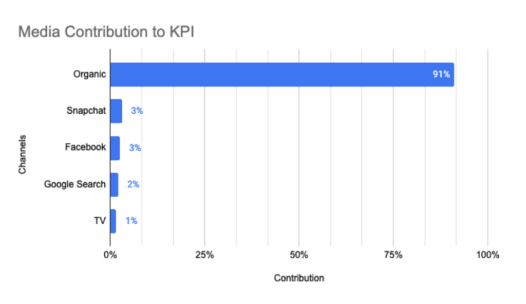
The image below provides a glimpse into a simple MMM contribution estimation. It displays an estimated percentage contribution of each channel to the Key Performance Indicator (KPI).
Beyond establishing contributions, an MMM model can also generate response curves for each channel.
What exactly is a response curve? In marketing, response curves are often used to estimate the impact of changes in marketing variables on consumer behavior or the end result in general. For example, a response curve can offer a visual representation of the output (such as a KPI) that results from a specific amount of ad spend. A visual example of these response curves for different channels can be seen in the accompanying image. In practice, a response curve serves as a valuable tool, helping you identify an optimal point for budget allocation. It guides you in distributing your budget to maximize results or output, essentially highlighting the ‘sweet spot’ for your investment.
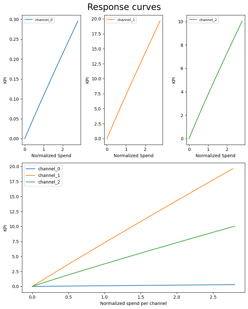
The figure above depicts response curves for each channel in the Lightweight Bayesian MMM tool by Google.
What are the available options for the MMM instantiation?
Let’s look at some examples of MMM models.
Meta and Google developed two open source tools to run a Marketing Mix Model, known as Robyn and LightweightMMM.
How does Meta’s Robyn work
Robyn modeling uses a Ridge Regression approach, allowing only statistically significant independent variables to remain in the model. Robyn is known for its fast training time and easy-to-interpret output. It can complete an MMM analysis in less than one hour with the right dataset. One of the key advantages of using the Robyn tool is its concise one-page output. This feature allows for compact and straightforward presentation of the final results.
Below you can see the example of Robyn’s final one page output that features the following graphics.
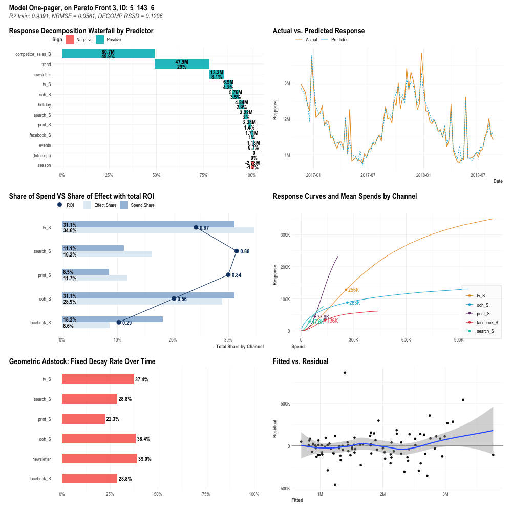
Now, let’s briefly examine these results and their interpretation.
Response waterfall final decomposition (top left plot): it is the immediate results of the MMM glorified regression model, with each statistical feature being attributed a contribution to our business KPI. It is worth noting here that seasonal features are automatically included in the model thanks to Meta’s tool Prophet.
- A FEATURE, is not only the single channel but also other information such as the weather or the date and time
- You can use this plot to break down the level of contribution of each single feature towards the total KPI (for instance the Leads), this understanding can help you improve your data quality, improve the quality of your channels/campaigns, and business in general
Actual vs predicted response (top right plot): This plot compares actual and predicted data for a response variable, illustrating how closely the model captures the real curve. The goal is to minimize the difference between the predicted and actual data, thereby optimizing the model.
- The goal here is to have the two lines (blue and orange) as similar as possible, the ideal scenario is that they are exactly the same
- The actual (orange) line is representing reality, the predicted (blue) line is representing the model output.
- You can use this information to understand how close to reality your model is, and therefore how realistic the rest of the information is
Share of spend vs. share of effect (middle left plot): This plot reflects the comparison of the total effect each channel had by means of the decomposition of the coefficients into the response variable divided by the total effect. It also reports the share of spending of each channel with the current budget allocation. One can also evaluate the profitability of every marketing channel thanks to the ROI.
- This is a plot full of information. It shows you how much you are allocating on a channel, how effective the channel is in spending the money and how profitable is the money spent per channel.
- You can use this information to discover how efficient your channel is in spending the money while keeping track of how much money it can spend. Ultimately allowing you to discover if your channels are hitting diminishing returns.
Response curves and mean spend by channel (middle right plot): For each channel, Robyn computes the response curves, evaluating how the KPI changes with respect to the spending. Every curve is Hill shaped, featuring an initial exponential growth, an inflection point and a final segment where the diminishing returns effect kicks in. The graphic provides an immediate representation of how the budget could potentially be reallocated better.
- A response curve, in essence, is a line plot showcasing how a value responds to an initial input. For example, a 10 CHF ad campaign might yield 100 CHF, while 11 CHF brings in 105, and 12 CHF nets 110.
- This data can guide decisions on whether to increase or decrease spending on a channel, based on estimated returns for various values.
Average adstock decay rate (bottom left plot): This plot shows the average decay rate per channel. The higher the decay rate, the longer the effect in time for that specific channel media exposure. The modeling of the Adstock effect – which is the lagged effect of advertising on consumer purchase behavior – heavily depends on the initial hyperparameter setting (Geometric, Weibull,…).
- The Adstock effect describes the delay between spending on ads, like Google Ads, and seeing a return. Essentially, it’s the time from when you invest in advertising to when a customer first sees, clicks, and buys from the ad.The decay rate is the amount of time instead until the last customer sees, clicks and buys.
- You can use this information to check when you can expect to see the effect of a campaign. To plan for future campaigns if you want to be sure the customer will see them on a particular day. To verify how effective the new campaign is or the the provider is in showing your content to your clients.
Fitted vs Residual (bottom right plot): This chart shows the relationship between fitted and residual values. A residual value is a measure of how much a regression line vertically misses a data point. If the residual values are normally distributed around the horizontal axis, a linear model might indeed be a good fit for our case.
- The plot above calculates ‘actual – predicted’, represented by the blue line. A value close to 0 signifies minimal error and an effective model. A flatter blue line indicates well-distributed error.
- This information guides technical teams on model selection based on the blue line’s shape. It also helps determine the model’s reliability at specific values, and the confidence in individual predictions.
How does Google’s LightweightMMM work
LightweightMMM is built with a Bayesian approach. LightweightMMM enables users to set arbitrary priors for all model parameters, acting as regularizers. Its appeal lies in its ability to integrate repeating seasonal patterns and geographical regions, adeptly handling complex scenarios like model constraints, market fluctuations, and regional trend variations.
Challenges to consider before implementing MMM
Before implementing MMM, it’s essential to consider these three broad areas of challenges:
Selection bias refers to having events that happened over time but did not get proper registrations within the system meaning that no numerical evidence is present within the data, (see Figure).
Data limitations refer to having too few or too bad data. Ideally, you should have a minimum of two years of weekly data, totaling at least 100 data points. However, sufficient data is useless without evidence of past behavior for future predictions (see Figure). Model selection is crucial; applying an incorrect econometric model can lead to undetected errors until it’s too late to rectify (see Figure).
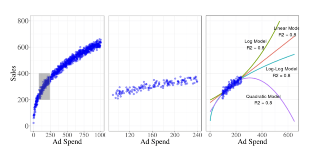
These three unique visuals offer varying perspectives on the same data set. Depicted in the left panel is the actual response curve. The middle and right panels display modeler-accessible data and four fitted response curves, respectively. These images graphically illustrate MMM pitfalls. The left image presents the real data distribution, highlighting a selected subset that’s magnified in the middle image. This image, however, offers fewer data points, making interpretation difficult, and these data are then duplicated in the right image. This right image demonstrates how various functions, indicated by colored lines, perfectly fit the data, leading to diverse results. Compare the purple line’s value at 600 on the ‘x’ axis with the red line’s, and again with the true response line from the left image.
Marketing Mix Modeling vs Multi-Touch Attribution
Obviously Marketing mix modeling is not the only way to analyze what drives your sales. Multi Touch Attribution (MTA) often emerges as a notable alternative to MMM. MTA aims to assign credit to every touchpoint along the customer journey. While MMM models interactions for each touchpoint instead of individual ones, this distinction is crucial as individual modeling implies tracking usage, potentially affecting data quality and quantity, especially for AI model training.
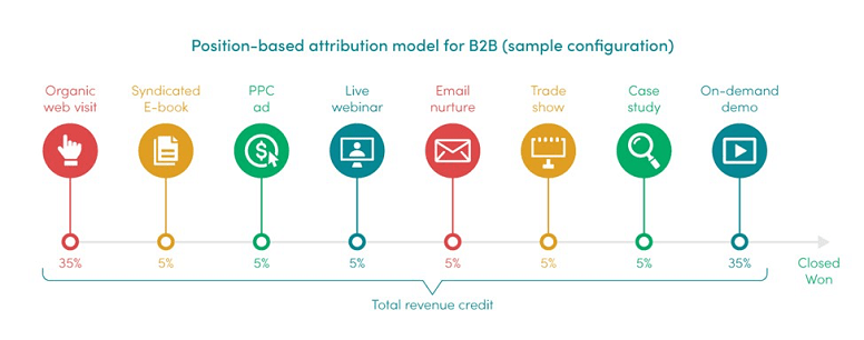
In the figure above, a multi-touch attribution model, where the credit for the sale is split across all the steps of the customer journey.
Let’s compare both methods.
NEXOYA vs MMM: Sounds complicated, what about Nexoya?
While Nexoya isn’t a direct alternative to Marketing Mix Modeling, it plays an instrumental role in optimizing the modeled mix of marketing channels through its data-driven approach.
Nexoya integrates a data driven approach to the modeled mix of marketing channels. Nexoya allows a business to have reliable budget optimization for the different marketing channels. So if MMM answers the question: how should I develop my marketing strategy and where should I market my product? Nexoya answers the question: How much budget should I assign to the campaigns in each individual channel of my marketing mix to maximize my return on ad spend?