
Reading the Performance View
The Performance view answers the question you’ll open Nexoya for most often: how are all campaigns across all channels doing, and where should I look closer? This article covers how to read it and how to use filters and metric comparison to get answers fast.
For the layout basics (summary KPIs, funnel, chart, campaign table), see Platform tour.
Reading the funnel
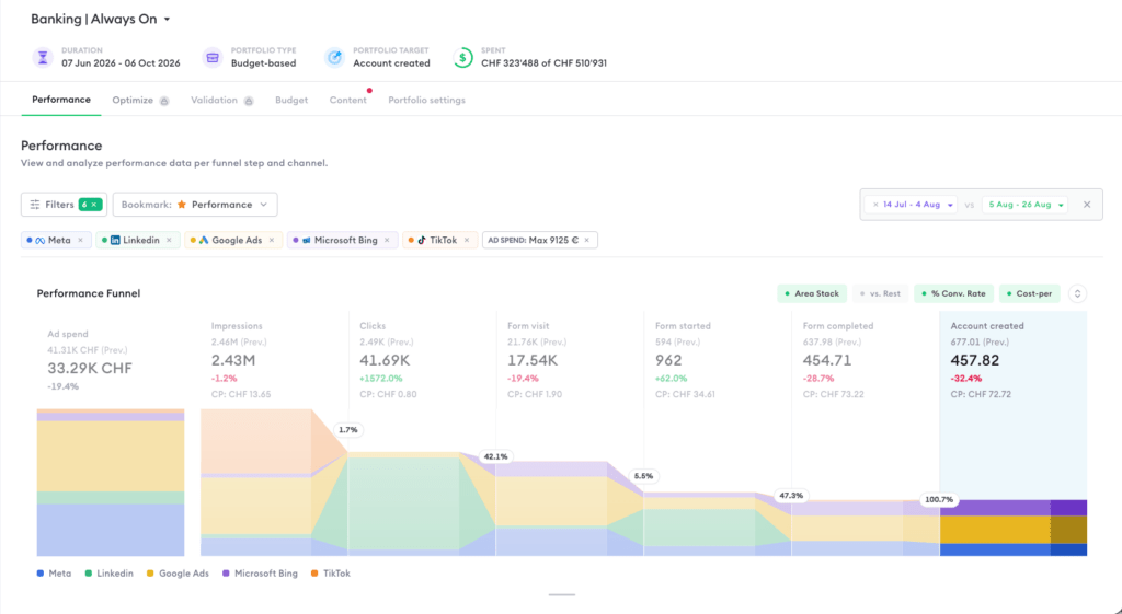
The funnel shows your volume at every stage of the customer journey. Hover over a stage to see its exact value and the conversion rate from the previous stage; a weak conversion rate between two stages shows you where volume is being lost. Clicking a funnel step selects that metric in the chart below, so the natural reading flow is left to right: spot the interesting stage in the funnel, then examine its development over time in the chart.
Conversion rates and cost-per metrics can be switched on and off next to the funnel, and the funnel itself can be expanded or collapsed.
Working with filters
Click “Filters” to narrow the entire view down to a slice of your portfolio. The panel has two parts: “Show data for” selects the channels, and “Only where” refines within them.
Channels: Show only campaigns from selected channels, for example Meta versus Google side by side. Within a channel, you can also filter by account.
Contents: Filter by campaign title with a contains-filter; multiple “contains” conditions can be combined with AND. This works hand in hand with a consistent naming convention, for example all campaigns containing “prospecting.”
Labels: Filter by your own tags, for example one market or brand versus non-brand (see Working with labels).
Content rules: Show one mapped group, for example all Meta Brand campaigns.
Ad spend range: Set a minimum and maximum total spend for the selected time period, to isolate your biggest spenders or the long tail of small campaigns.
Content type: Show campaigns, ad-sets, or both. Useful when channels deliver data at different levels and you want to compare like with like.
The panel also contains filter sections tied to Nexoya Premium features, such as optimization state and attribution groups. In Nexoya Starter these stay empty.
All active filters combine in AND logic, and they apply to the funnel, chart, and table at the same time, so every section always shows the same slice. Combining the label and channel filters is especially effective: one label plus one channel isolates exactly the campaigns you want to review.
Saving and sharing presets: Configure your filters, click “Save as new” in the filter bar, and name the preset. Presets are private by default; to share one with your team, open the preset list, click “Manage,” and use the “Share with team” icon. Create one shared preset per recurring reporting view, for example per market or per campaign type, so everyone reviews the same slice of data.
Comparing metrics
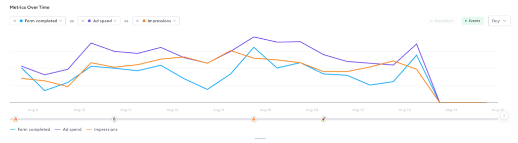
The chart shows up to three metrics on a shared timeline. This is the core diagnostic tool of the view, because one metric alone rarely explains anything. The combination that answers most questions: your portfolio target, Ad Spend, and one volume metric such as Clicks. If conversions spike, the comparison immediately shows whether spend rose too (a budget effect) or stayed flat (a real efficiency improvement).
Data can be aggregated by day, week, month, or quarter. Use daily aggregation to investigate a specific change, and weekly or monthly to judge trends without daily noise.
Digging into campaigns
When the funnel and chart point you to something, the campaign table gives the detail. Group campaigns by channel or label to compare groups, sort by any column to find the outliers, and pin or reorder the columns you care about. Table layouts are saved between sessions and can be shared with your team.
Can’t find the answer to your question?
No problem, you can submit your question to us here.
Contact