
The Performance View has been redesigned from the ground up. This article walks you through every improvement and shows you how to use the new features effectively.
How to Access the Performance View
The Performance View has long been one of the most-used areas of the Nexoya platform. It is where you get a clear, cross-channel picture of how your campaigns are performing — funnel behaviour, trend charts, and campaign-level data, all in one place. For many teams, it is the first screen opened every morning and the last one checked before a weekly report goes out.
Based on feedback from performance marketing and marketing operations teams, we went back to the drawing board. The goals were clear: reduce visual noise, make key information faster to find, give teams more analytical flexibility, and make it easier to align on the same data. The result is a view that handles both quick daily check-ins and deeper analytical sessions without requiring workarounds or spreadsheet exports.
This release brings six concrete improvements. Each one is described in detail below, together with practical tips for getting the most out of it in your day-to-day work.
1. Improved Layout and Readability
The entire page layout has been redesigned with a clearer top-to-bottom hierarchy. Summary-level KPIs appear at the top, followed by the funnel, the trend chart, and the campaign table below. Each section has a defined role, so it is always clear where to look first and where to go for more detail.
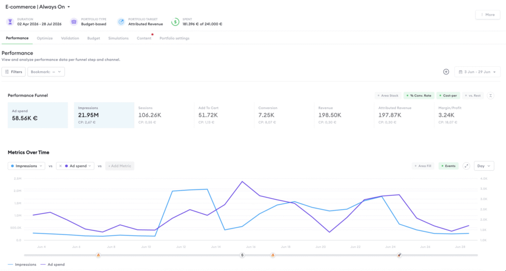
Visual noise has been reduced throughout. Labels are cleaner and more consistent, spacing is more generous, and contrast has been improved so that the numbers you care about stand out immediately. The result is a view that feels faster to use — not because it has fewer features, but because the structure guides you to what matters.
2. Horizontaler Funnel
The marketing funnel has been redesigned from a vertical to a horizontal layout. All funnel stages — from Impressions through Clicks, Sessions, Leads, and Conversions — are now displayed side by side in a single left-to-right view.
This change has two immediate practical benefits. First, you can compare all stages at a glance without scrolling. Second, the proportional relationship between each stage is immediately visible. It is much easier to see at a glance where volume drops off and how severe the drop is. Understanding funnel shape previously required either scrolling through a vertical layout or mentally reconstructing proportions — the horizontal design makes it instant.
- Hover over any funnel stage to see the exact value and the conversion rate from the previous stage. This is a fast way to identify the weakest step in the journey without switching to a separate report.
- The performance Funnel can be expanded and collapsed by using the arrows right next to the funnel.
- Conversion rates, Cost-per numbers can be separately switched on and switched off.
- Clicking on a funnel step selects the main metric in the chart.
3. More Powerful Filters
The filter system has been substantially expanded. Access is provided by clicking on the “Filters” button. You can now filter the Performance View across a much broader set of dimensions. All filters apply simultaneously to the funnel, the chart, and the campaign table — so everything stays in sync, and you never have to wonder whether a number reflects a different filter state in one section versus another.
Available filter dimensions
The following filters are available in the new Performance View:
- Channel / Integration Filter by a specific marketing platform, for example Meta Ads, Google Ads, LinkedIn Ads, or TikTok. Useful for single-channel analysis or for excluding certain platforms from a cross-channel view. It is also possible to filter by account within a channel.
- Optimization state Filter by the current optimization state of each campaign.
- Title You can enter a text which enables a contain-filter. Multiple “contains” can be connected by “AND”.
- Attribution Group Filter by a selection of attribution groups (only available, if Attribution has been activated for this portfolio).
- Content Rule Filter by content rule.
- Impact Group Rule Filter by impact group rule (only available, if Attribution hasn’t been activated for this portfolio).
- Ad Spend Range Filter for total ad spend in the currently selected time period.
- Label Filter by any label applied to campaigns in your portfolio. Labels allow you to group campaigns by type, region, objective, funnel stage, or any other dimension your team uses.
- Multiple filters are always combined in “AND”-logic.
- Combining the Label and Channel filters is especially effective for structured campaign reviews. Select a specific label (e.g. “Brand Awareness”) and a single channel to isolate exactly the campaigns you want to analyse, without exporting to a spreadsheet.
4. Persistent and Shareable Filters
Once you have configured the filters to match a specific analysis view, you can save that configuration as a named filter preset. The next time you open the Performance View, your saved presets are available with a single click. There is no need to re-apply the same filter combination every time you start a session.
By default, filters are private. Saved filter presets can also be shared with your team. This means everyone in your organisation can access the same standardised views. A “Weekly Performance Review” preset used by your head of performance and your marketing operations manager ensures both are always looking at the same slice of data, with no ambiguity about which campaigns are included.
To save a filter preset: Configure your filters, click “Save as new” in the filter bar, and give it a name.
To share a preset: Open the saved preset list, click on the “Manage” link and then click on the “Share with team” icon.
- Create one shared filter preset per regular reporting cycle — for example, one for your weekly performance review and one per campaign type. This removes the most common source of inconsistency in collaborative reviews: two people looking at the same portfolio with different filter configurations.
- Shared filter presets can also be reverted to a private filter.
5. Multi-Metric Chart Comparison
The performance chart now supports multiple metrics displayed simultaneously on a shared timeline. You can add up to 3 metrics as needed and compare their behaviour side by side over the selected period.
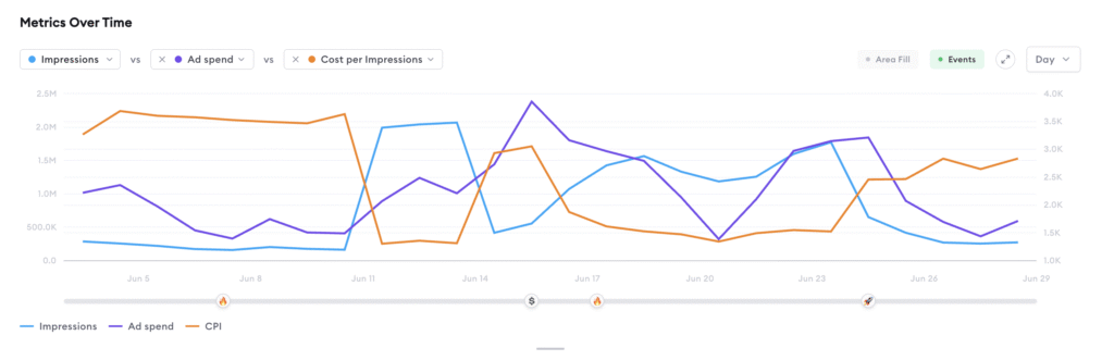
A particularly useful addition is the ability to include Ad Spend directly in the chart alongside performance metrics. Displaying spend and conversions on the same timeline makes it immediately visible whether a spike in performance is driven by a budget increase, or whether it is an organic improvement in efficiency. Identifying that kind of relationship used to require a custom spreadsheet export. It is now built directly into the view.
Each metric gets its own colour and, where the scales differ significantly, its own axis (only for 2 metrics). This keeps the chart readable even when comparing metrics with very different magnitudes, such as Impressions alongside Revenue or CPA.
- A strong starting combination is your primary KPI (e.g. Leads or Conversions), Ad Spend, and one upper-funnel volume metric (e.g. Clicks or Impressions). This gives you both a performance signal and a budget signal at a glance, and is a solid foundation for any weekly stakeholder conversation.
- The data in the chart can be aggregated by day, week, month and quarter. The availability of these options depends on the currently selected period length.
6. Configurable and Shareable Table Layouts
The campaign table at the bottom of the Performance View is now fully configurable. You can choose which columns to display, reorder them, pin the most important ones to keep them visible when scrolling, and group campaigns by different dimensions — such as channel, label, content type, or funnel stage.
Table configurations are persistent: your column selection and grouping are saved between sessions, so you always return to the layout that works best for you. You can save multiple named table layouts for different purposes — for example, a “Budget Overview” showing spend, CPA, and ROAS, and a separate “Funnel Performance” view focused on impression-to-conversion rates.
Just like filter presets, saved table layouts can be shared with your team. This ensures everyone works from the same structure when reviewing campaign data together. All columns are sortable: click any column header to order the table by that metric and quickly surface the campaigns with the highest spend, the lowest conversion rate, or the largest change week-on-week.
Need Help or Have Questions?
If you have questions about the new Performance View or would like a guided walkthrough of any feature, your Customer Success Manager is happy to help.
You can also watch the release walkthrough video, which demonstrates each of these features directly in the product.