Diving into campaign optimization can feel like wandering through a fog – so much data, endless campaigns, and that tricky puzzle of budget allocations. We know how overwhelming it might feel!
We’re here to resolve this mystery!
Picture this: you’re in control, choosing how deep you dive into the data, from a quick glance to a detailed view. Flexibility is at your fingertips. Gliding through your optimization results has never been smoother. You’ll find interpreting and acting on your campaign data is a piece of cake.
We’ve assembled a quick guide for you on how to get the most out of the Optimization view.
Simplified UI and Improved Navigation
Here’s how you can navigate through the optimization landscape:
Accessing Optimizations
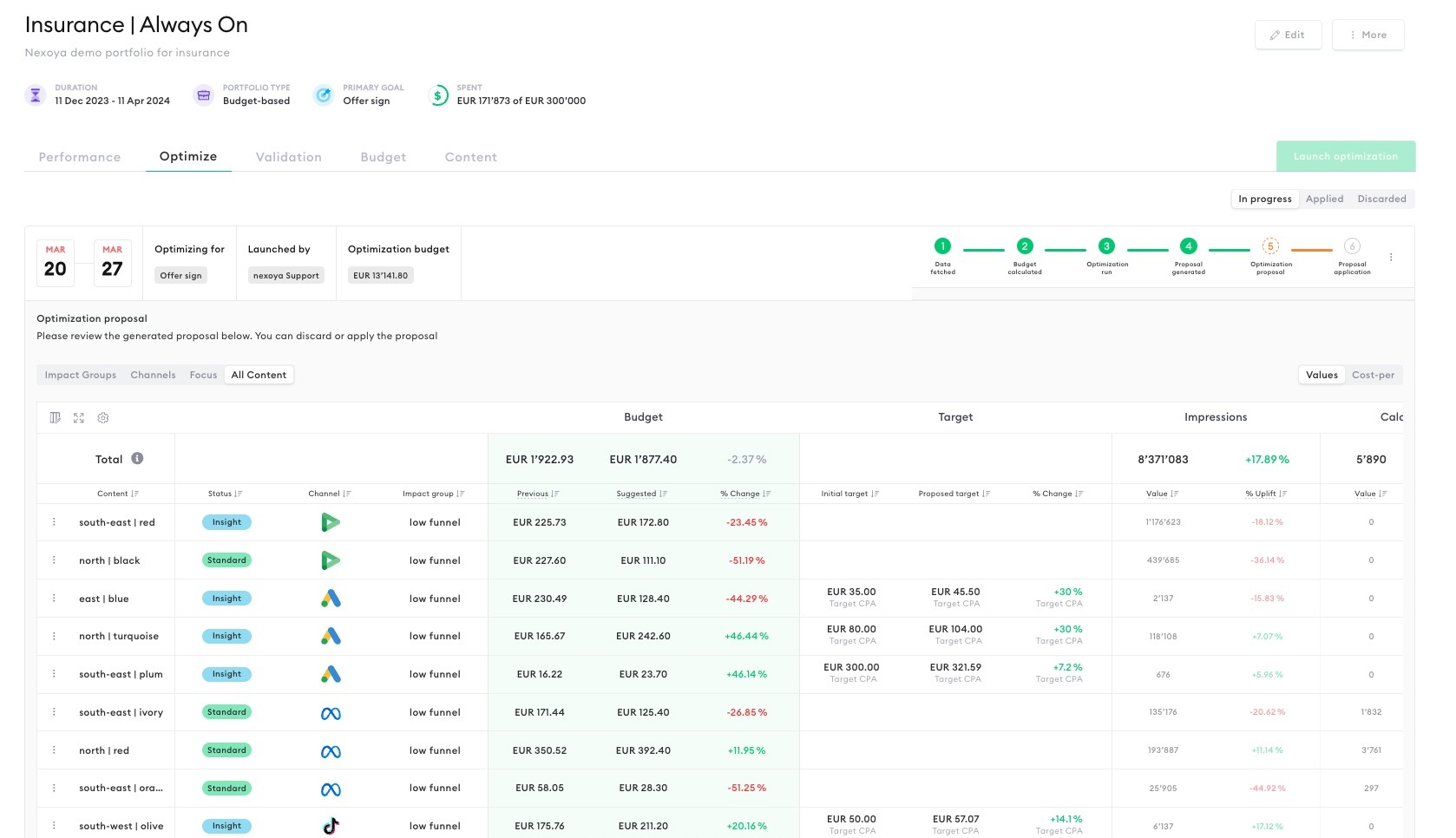
Simply head to the “Optimize” tab within your portfolio. From there, use the sidebar to filter optimizations based on their status – whether they’re ‘in progress’, ‘applied’, or ‘discarded’.
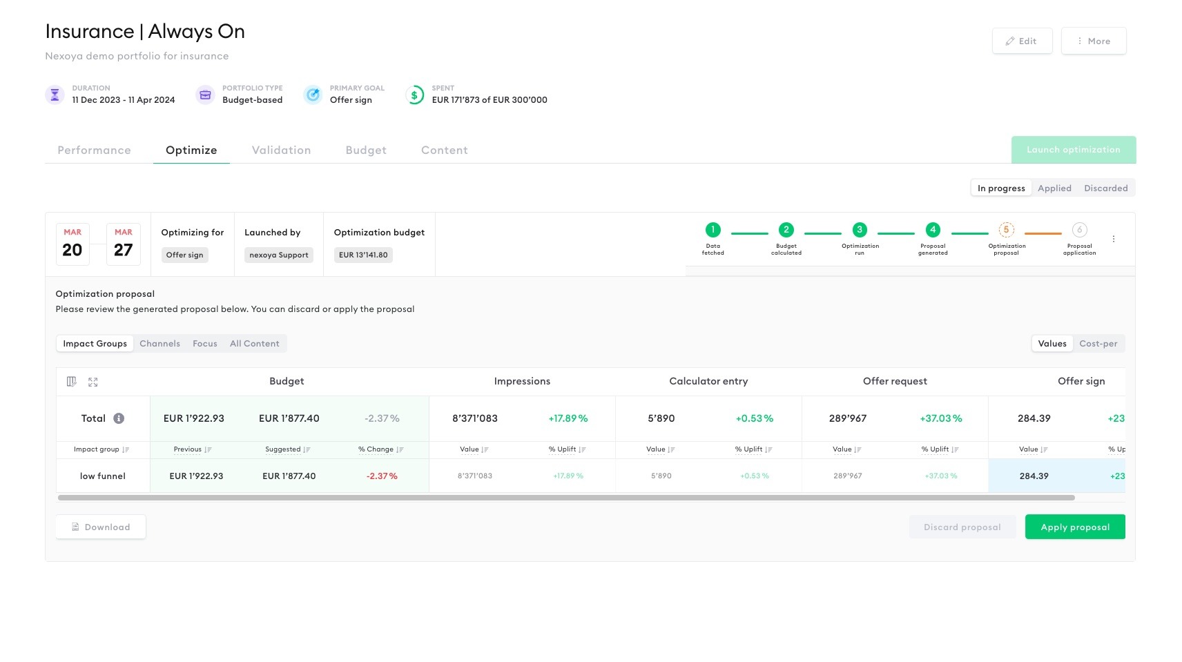
In the upper left corner, you’ll find the date range for the current optimization, alongside crucial details about it, such as the main goal and the allocated budget for optimization. On the right side, the status of the optimization process is clearly outlined through six key steps: 1) Data Fetched, 2) Budget Calculated, 3) Optimization Run, 4) Proposal Generated, 5) Optimization Proposal, and 6) Proposal Application. This feature allows you to effortlessly track the current phase of the optimization process at a glance.
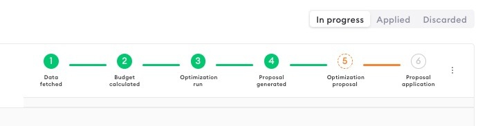
As soon as a new optimization proposal is ready, it will be prominently displayed in the Optimize tab, ensuring you’re always up-to-date with the latest recommendations for your campaigns.
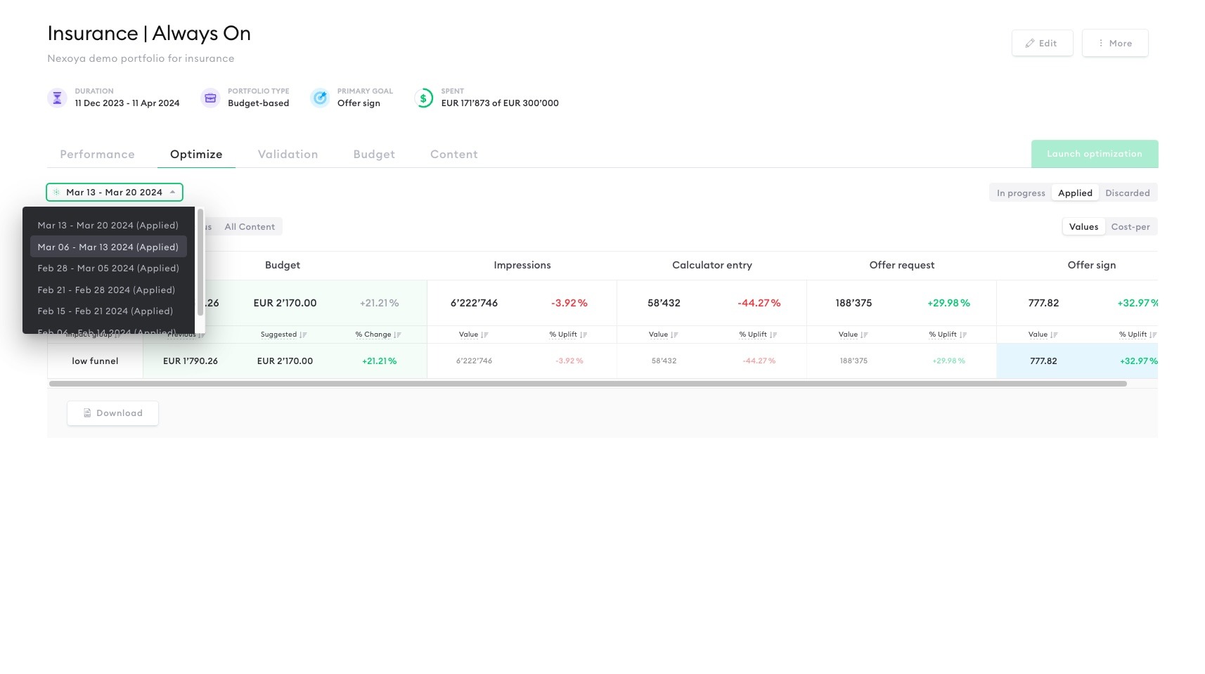
Would you like to look at previous optimizations?
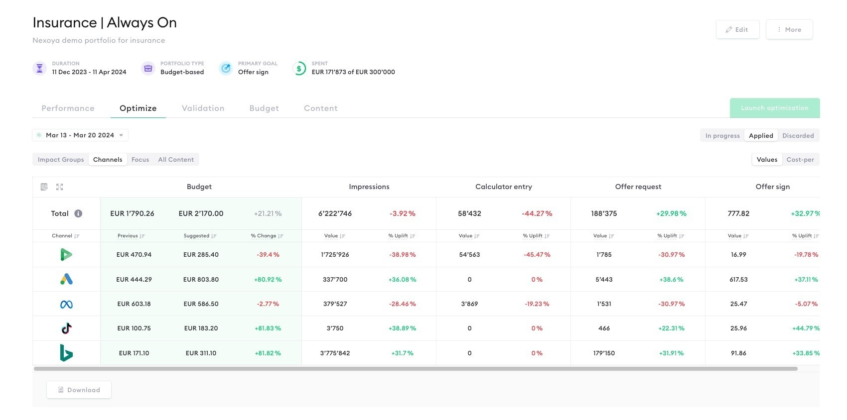
Navigating to the “Applied” tab allows you to effortlessly revisit previous optimizations. Just choose the date range you’re interested in, and the relevant proposal will be instantly available for your review.
Status Labels
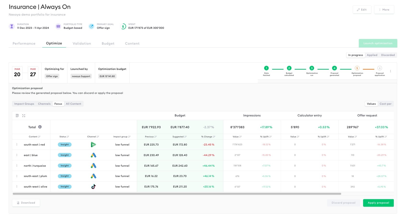
Each campaign is now marked with one of four status labels allowing you to do a quick campaign “health check”:
1. Standard: Indicates that a content doesn’t underlie any limitations in the current optimization and no special case was identified.
2. Limited: Points out campaigns limited by factors such as budget constraints or high impression shares, with a blue information icon for non-actionable cases.
3. Insight: Provides valuable insights into your campaign: e.g. whether your campaign has reached a high saturation score.
4. Skip: Identifies campaigns that were skipped from the optimization for reasons like insufficient data or campaign end. It’s important to note that the content can be skipped either by the user or the optimizer. Users have the option to skip content from the content screen (affecting all optimizations) or directly within a proposal (specific to that proposal only).
Understanding Saturation Curves
Ever wondered why pumping more budget into a campaign doesn’t always mean more impressions? With this feature, you can click “see details” on any campaign with high saturation (check the “Insight” label) and uncover the mystery.
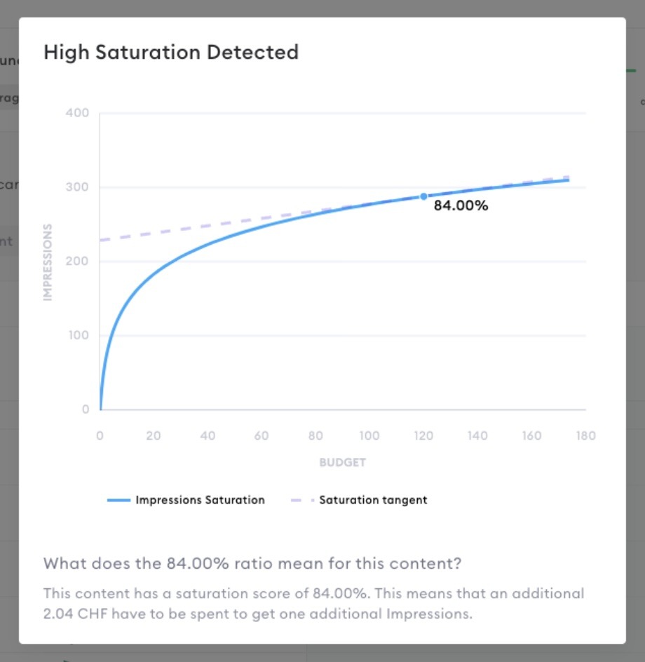
The saturation curve graphically represents how your campaign reacts to budget changes, revealing why adding more funds might not always be the answer. As the curve flattens, it signals reaching a point where additional budget won’t push your impressions further – it’s the visualization of diminishing returns in action.
Enhanced Insights and Multiple Views
With the Optimization Proposal feature, you can choose from four distinct views, each tailored to different needs:
- Impact groups
- Channels
- Focus
- All Content
Let’s have a look at all of them.
Impact Groups
Purpose: This view categorizes campaigns by marketing funnel goals (like awareness or conversion), offering a structured look at performance metrics across different stages of the funnel.
How it Works:
- Campaigns are categorized into impact groups, each representing one or multiple steps in the marketing funnel.
- Data is displayed in two dimensions: vertically by impact group and horizontally by funnel steps, with key metrics highlighted for easy reference.
- A ‘totals’ line at the top provides a snapshot of the overall optimization impact, including daily budgets and metric totals for the optimization period.
- This view focuses exclusively on metrics included in the optimization, omitting skipped content to ensure clarity.
- It’s crucial to differentiate: a budget change reflects the variation in percentage between the recommended budget and prior average spend. While the “Uplift” shown for each funnel step represents the performance improvement relative to a baseline scenario without optimization.
Channels
Purpose: Get an aggregated overview broken down per channel, understanding the performance metrics and strategic budget allocations to enhance overall performance.
How it Works:
- Similar to the Impact Groups view but centers on channels as the primary axis for comparison, allowing for a cross-channel performance evaluation.
Focus
Purpose: Designed to spotlight the contents which have limitations, specific insights or a special situation (including campaigns marked as ‘skip’), making it easier to grasp essential updates at a glance.
How it Works:
- This tab is your go-to for a concise overview of the most significant adjustments, including campaigns categorized as Limited, Insight, or Skipped.
- It’s perfect for those times when you need to quickly understand the key updates without delving into every detail.
All Content
Purpose: Provides a granular look at your campaigns
How it Works:
- Dive deep into every detail with the “All content” view, which uses symbols to mark performance traits and advises on data interpretation, helping you identify both high-performing content and areas needing improvement.
- By default, skipped content is hidden, but you can opt to display it through the table view settings by toggling the ‘skip content’ option on or off.
- Expand the view by clicking the expand icon in the left corner near the table settings to use the full screen size.
- Manage your columns and pin them for enhanced readability – customize the view to your preferences.
- Each column is sortable, allowing you to quickly identify campaigns with the highest/lowest budgets or the most significant changes.
- Furthermore, we’ve kept the feature that allows you to seamlessly switch between value metrics and cost-per metrics, accessible via tabs in the right corner of the table.